We had an earthquake in San Diego at about 11:55 pm on October 30th, 2001. It was a 5.1 magnitude, and the epicenter was in Anza, CA. I felt
it quite a bit. The water in my glass visibly moved, and my computer monitor shook noticeably. It went on for quite a while, but I can't
guess exactly how long it was. According to some seismograms I found, it lasted for over a minute. It was fairly disturbing, but also
intersting at the same time. However, I probably would have felt better if I had been on the ground floor of my house.
I decided to save the seismograms I found, since they update automatically. If I didn't save them then the "snapshot" would be lost.
They are from University of Arizona's seismometers. I added an explanation of what each graph is.
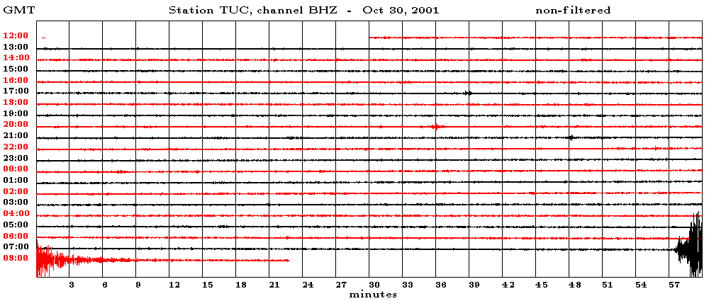
This displays the broadband vertical data. This is basically a "recording" of all the frequencies "heard" by the
seismometers. The typical range for earthquakes is 50 Hz to 0.001 Hz. The frequencies are measured by their period, with one second being 1
Hz.
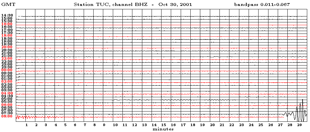
This displays the long-period data which will clearly display large (magnitude greater than 5.5) earthquakes. The long
period waves are those with periods greater than 10 seconds -- the powerful ones. This graph will show the really big quakes very well
since all the short period (or high frequency) stuff is filtered out. You don't want to be around when there's a big squiggle being recorded
on this graph...
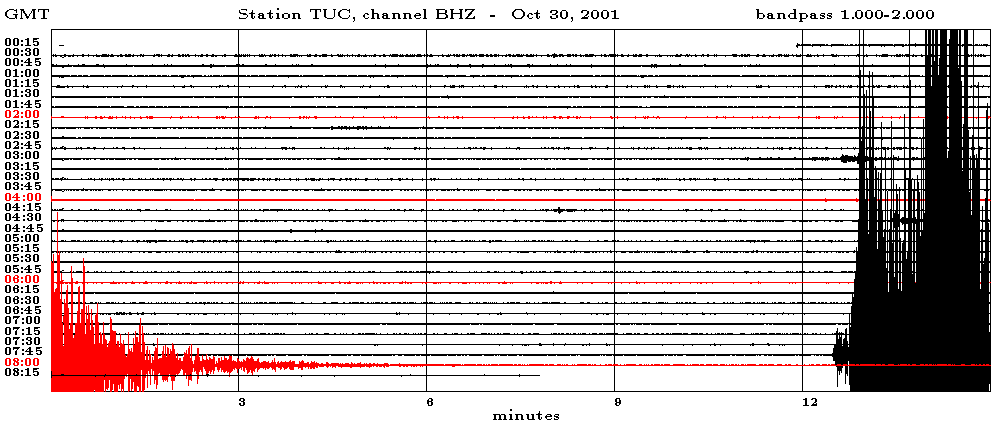
This displays the high-frequency (short-period) data. This will also record mining activity, underground nuclear testing, and
the like very well.
That's all I could find from UofA. If I still lived near the Gould-Simpson building, I'd be able to go in tomorrow morning and grab a real
paper seismogram. I used to have one from the Northridge quake and one which showed a Soviet underground nuclear test taped to my fridge.
I nabbed some really cool maps from TriNet.
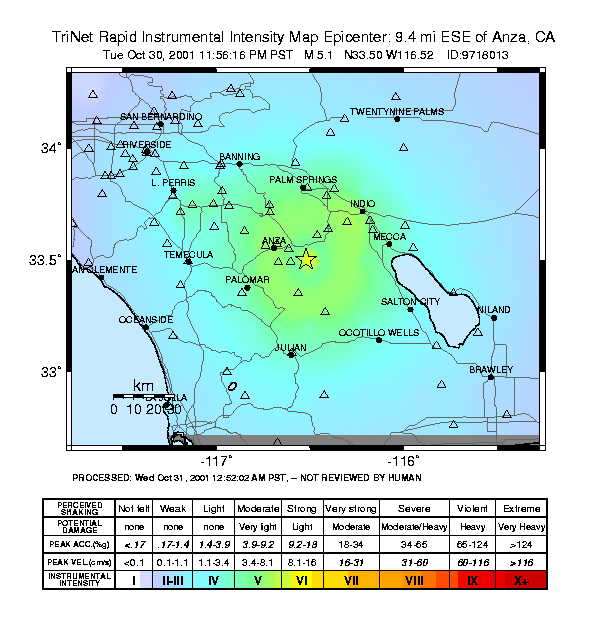
Intensity: This is an intensity map. I think it's purpose is to show people how far from the epicenter (which is the yellow star) a quake
could be felt. So it's basically a Mercalli Scale map I guess.

Peak Ground Acceleration: This shows how much the ground accelerated in the area near the quake. The more acceleration, the bigger the quake
(and worse it is, naturally).
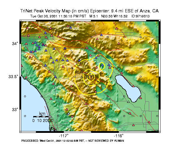
Peak Ground Velocity: A map of how fast the ground was moving. Like the map above, the more it was moving, the more intense the earthquake.
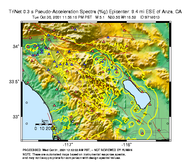
Spectral Response: Honestly, I've got no idea. I'll go look it up online, but I included the map now because I thought it looked pretty cool.
The last thing I nabbed of the TriNet site was a guide for newscasters. It has the specific stuff about this quake,
and it's incredibly funny.
Chris Grout (a coworker) found some info about the quake on the Caltech USGS web site.
Their site was overloaded, so I could only get to one map.
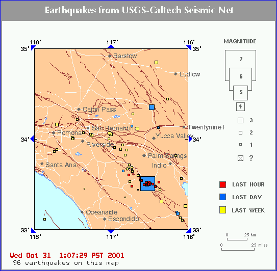
This is a map of all the earthquakes recorded for a certain periods of time. The one I felt is the big blue square. The little red squares
are likely aftershocks. You usually see either foreshocks or aftershocks in little swarms like that. For reference, my house is about 15
miles south of Escondido.
If I find any more seismograms or maps, I'll put them up here.